
BRIEF: To create a unique yet on-brand look and feel for a free online course offered to Swinburne students, that helps them to identify their purpose (both professionally and personally).

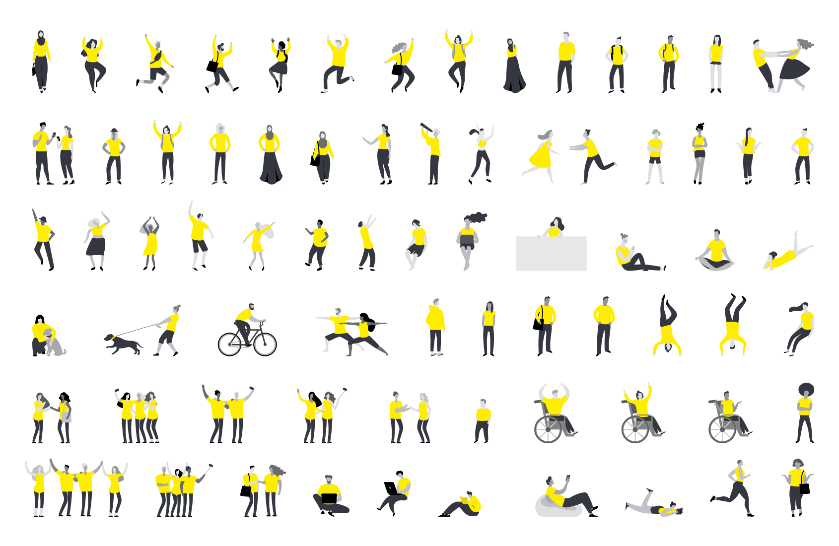
The stakeholders wanted the design to have it's own recognisable look and feel, whilst remaining on-brand. To achieve this, I defined a simple illustration style using only the Swinburne brand colours. As the course is all about finding your own personal uniqye purpose, I wanted people (of all shapes, ethnicities, genders) to always be present in the desings.

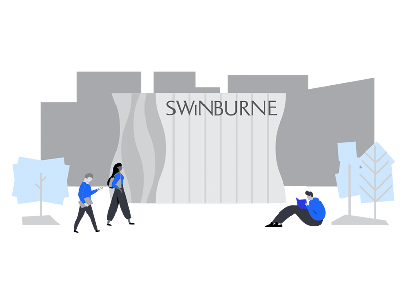


The course was set out in three stages, with the intention that the student would complete one stage per year, and as they progress through the course their purpose will become more clear. To achieve this in the design, I used a specific colour for each stage, and the organic background shapes from stage one slowly become more rigid, clear and defined as they progress through the stages.
By the end of stage 3, the characters look more confident, and the background imagery looks cleaner and more defined.
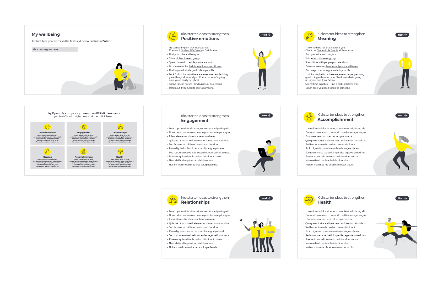
Overall, I think the designs really hit the mark and created a unique look and feel for the course.