
BRIEF: To refresh and expand upon the previously rigid, corporate ADC brand, whilst still maintaining the same logo.

The previous ADC brand only included a logo, and two colours (orange and dark grey), which as resulting in the branded materials looking the same, and the overall brand experience being dull.
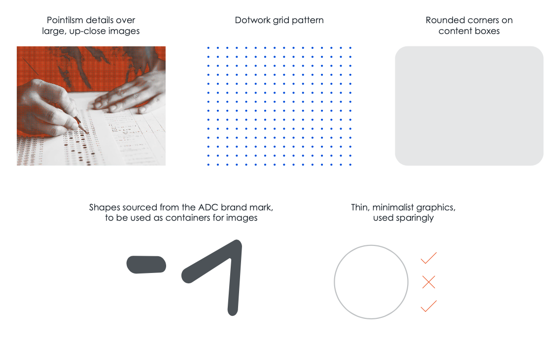
I provided a suite of concepts for how to expand upon the brand. The chosen concept uses a dot-work grid pattern, overlaid on key images (and also as a standalone pattern), which represents the many accreditation and assessment requirements that are a key part of the ADC scope of work.
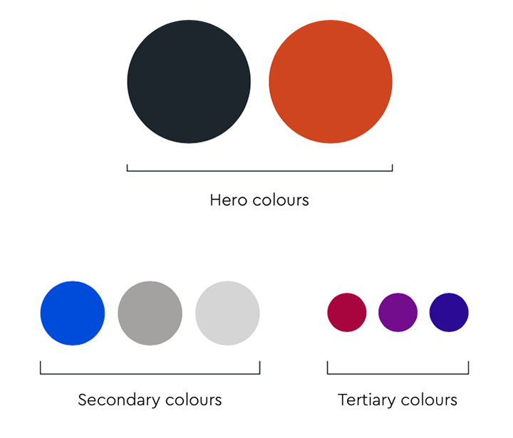
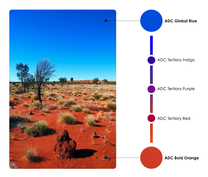
In addition to this, I expanded upon the colour palette by introducing an additional hero colour (global blue), which represents international accreditation and assessment (a strategic goal of the organisation). From this colour, I found a gradient from blue to orange, and selected three tertiary colours, which can be used for charts/graphs.


The ADC brand is now a lot more flexible and visually interesting, whilst still remaining recognisable within the sector.
Read the complete brand style guide:ADC Brand Guide (PDF, 1.2MB)